2022
CareerFoundry

part 1 + part 2 + part 3
inspiration user design
Where did the idea come from
During an intense six months of discovery, learning, and applying new skills, I stepped into the world of UX. This case study is the most significant outcome of that journey. Here’s how it all began…
I used to struggle with sharing my creative work beyond family and friends. Over time, I realised the true focus should be on the creative process — not just the final outcome. Through conversations with others, I discovered that many people face similar challenges with creative confidence — more than I had initially thought. Creative Confidence by Tom Kelley and David Kelley really resonated with me along the way.
One of the biggest challenges early in this journey was deciding what to keep from the big picture and what to set aside. Several great ideas emerged, but with limited time and resources, it was essential to prioritise and focus on delivering the MVP (Minimum Viable Product).
First steps
After coming up with the idea, it’s always useful to check if others have explored similar concepts. Learning from their pain points and successful solutions can provide valuable insights for development.
I conducted a classic SWOT analysis to identify which pain points I could avoid and which strengths I could incorporate into my project.
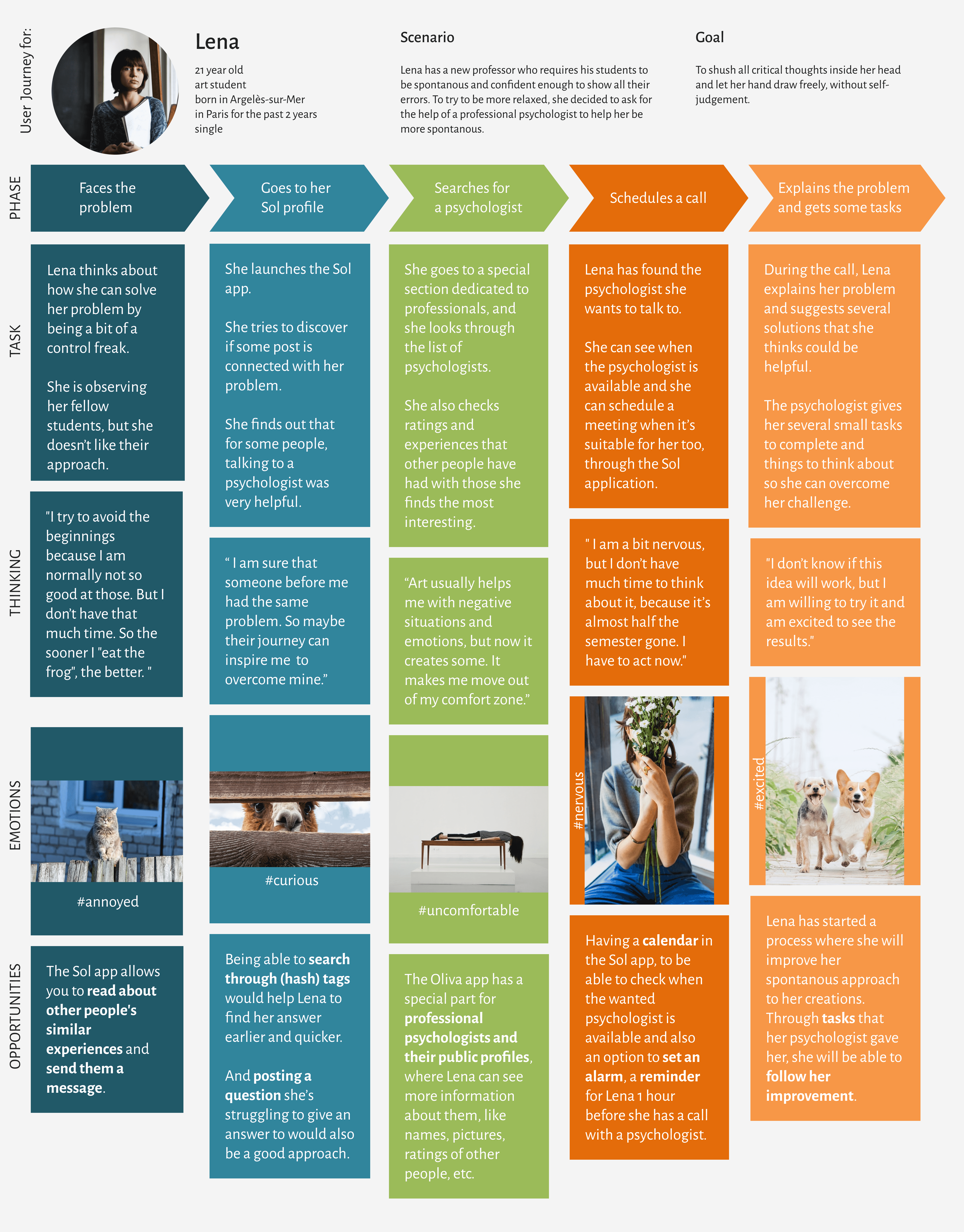
User Persona & her journey
Meet Lena.
She’s a very creative — but also very self-critical — person. Her strength lies in the magic she creates with a pencil, pen, brush, or really any tool she puts in her hand. She’s detail-driven, great at capturing moments, always gives her best, and is a highly reliable person.
But... sometimes she’s too hard on herself. Her biggest challenge? Learning how to relax and quiet her inner critic.
Here is her journey to overcoming intense self-criticism:
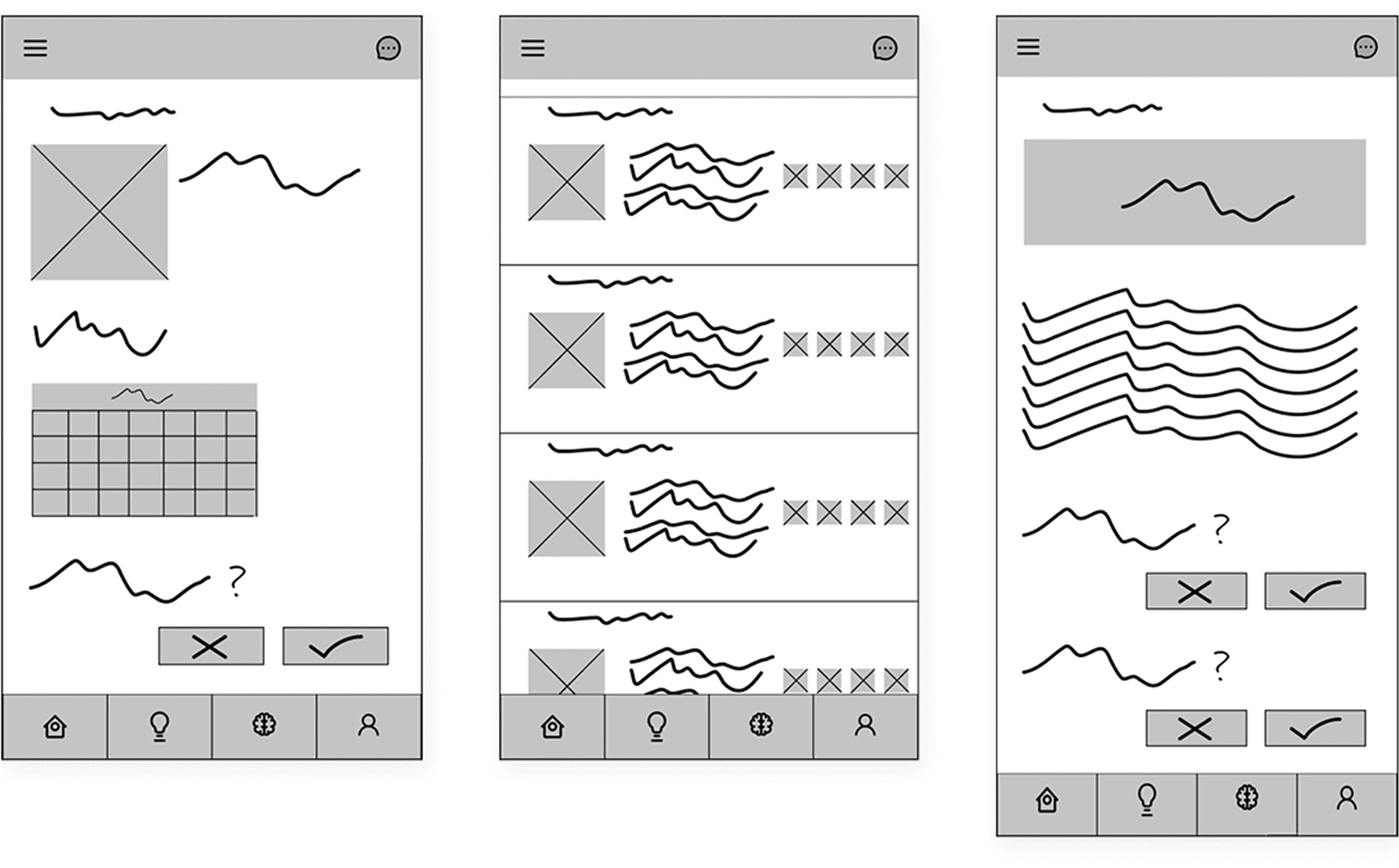
Methamorphosis
UI Elements


Usability testing
Now it was time to change hats — to shift from designer to observer. Users began interacting with my prototype, and my goal was to identify their pain points, likes, and dislikes — and ultimately improve the design.
Bit by bit, the project was evolving into a more polished product. Below, you can see before-and-after comparisons. Many opportunities for improvement became clear through usability testing.

Key learning points
The most valuable part of this process was usability testing itself — watching others interact with my app, hearing their thoughts (and sometimes what they didn’t say), and noticing where they struggled or where they were delighted.
For example, I learned that using a lightbulb icon to represent "create new project" wasn’t as intuitive as I had imagined. Other small details also became obvious during testing — such as the importance of leaving at least 32px of space below the navigation bar, to account for existing system buttons on Android and iOS devices.
One of the most rewarding parts of this process was taking user feedback and using it to improve the design.
The goal isn’t just to make something that looks good — but to create something that is genuinely useful.
Conclusions
This was my first fully detailed UX project. Since I was the only person working on it, the process was challenging — but also incredibly rewarding, as I watched the product take shape and evolve.
Iterative design gave me the freedom to go back and improve things along the way, which made the process feel much more approachable.
But the most valuable part of this journey was gathering insights from others and using their feedback to improve the app. That experience really deepened my understanding of UX design — it’s all about listening, learning, and iterating.
